What is responsive design? How does it work? What are the most commonly used tools, and how are they used?
If you want to learn the basics of quality responsive web design, we’ve summed up everything in one place. Let’s dive in! 🙂
Table of Contents
- Web Design Introduction
- Defining Responsive Web Design
- How Responsive Web Design Works
- Designing Flexible Layouts
- Designing using Media Queries
- Why Your Bank Needs a Responsive Web Design
- Final Words
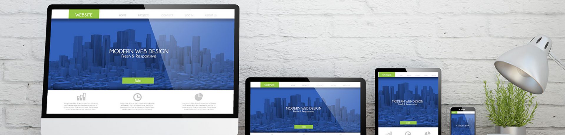
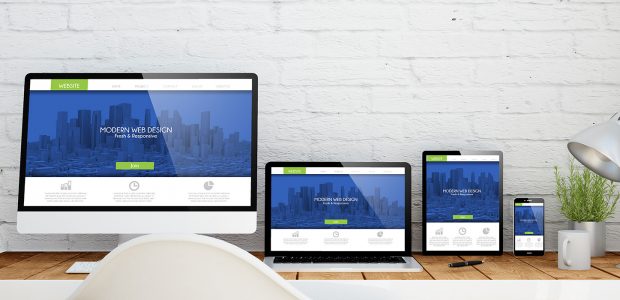
Using mobile devices to surf the internet is growing rapidly, and having a mobile version of your site is a must. Make sure you keep up with the requirements for a well-designed website with responsive design.
Customers should be able to easily navigate your site regardless if they access it using a smartphone, tablet laptop, desktop computer, or other electronic devices. Responsive design provides the best user experience on your site, no matter what type of device your customer uses to view it.
The rule is simple: all screen resolutions must be compatible. This allows design consistency on your site across a broad variety of devices.
Defining Responsive Web Design
Responsive web design (RWD) is a design approach first introduced by Ethan Marcotte back in 2010. RWD, also known as adaptive or mobile design, adapts a website to the screen size of the user’s device. Adapting to changes and behaviors provides an amazing user experience.
Website responsiveness also helps refine your content. You should focus on assuring that everyone viewing your site on a mobile device sees the most important information first.
How Responsive Web Design Works
Responsive sites use grids that follow width rules defined by the web developer.
Let’s say that you build your site using a three-column grid. Instead of specifying the column size in pixels, responsive design specifies column size proportionally as a percentage. For example, the first column might measure 35% of the page width, the second column might be 15%, and the third column would fill the remain 50% of the page.
Open source tools, such as Bootstrap and Zurb Foundation, allow web developers and designers to create responsive sites easily.
If you’re new to website development, the World Wide Web Consortium (W3C) provides guidelines and standards that ensure powerful interactive experiences across a variety of devices. You can also find some good HTML and CSS practices on sites, such as w3schools.com, to learn more about creating flexible layouts by adjusting the viewport.
A viewport is the visible area of a website on the user’s device. CSS specifies the size of the viewport using four unit measurements: viewport width (vw), viewport height (vh), viewport maximum (vmax), and viewport minimum (vmin).
The viewport’s width and height are adjusted proportionally based on the specified measurement. For example, a viewport width of 1vw would equal 1% the width of the viewport. The minimum and maximum dictate the largest and smallest sizes the width and height can adjust to depending on the device being used.
To calculate the proportions to achieve a flexible layout, Ethan Marcotte developed the following formula:
target_element_width ÷ parent_element_width = result
If you want to adjust screen sizes even better, consider using a media query. Applying a media query to a CSS style allows you to shape your design intelligently on a micro-level. The media query personalizes the site design based on the type of device being used to view it.
Images, videos, embedded content, and other elements make your website more interesting and interactive. A media query not only adjusts the size of the viewport, but it also perfectly positions these elements, including advertisements, on your webpage. Media queries ensure these elements adjust accordingly and proportionately. When the element increases in the width, it increases proportionately in height as well. The same holds for reducing the size of the elements.
Why Your Bank Needs a Responsive Web Design
Mobile traffic accounts for more than half of internet traffic. Listening to users and designing your website with them in mind gives you a competitive advantage.
Consider these marketing statistics:
- People have twice as many interactions on mobile compared to other devices.
- Mobile-focused design dominates the market.
- Users are more prone to recommend and buy from companies who address their concerns and meet their needs.
Don’t you want to have a flexible layout that will adjust to your users’ needs?
Responsive web design is the solution. Take control of what your users see. The best part is that responsive design is Google approved, so it will boost your SEO performance, too!
When choosing the right web company to create or work on your website, hire someone who understands these principles and applies them in practice every day. BankSITE is proud to share that we’ve changed our clients’ lives by following these steps.
As a web company, we help simplify the complexity of creating beautiful websites that your users will love and interact with, especially when it comes to creating awesome experiences for bank websites. We take care of every detail on the user journey by creating well-designed websites just for your needs.
Keep up with the trends and the future now, and do everything you can to have a quality, responsive design today.